this looks nicer...
Tuesday, 28 June 2011
Monday, 27 June 2011
Beauty and the Beast - Waterstones competition
I have not really left myself much time for this one!
first round entries are to be submitted by the 4th July, so to make sure its in the post in time I need to post it by Friday!
Anyway, some Beast silhouette concepts! Decided to make two circle-base, triangle-based and square-based...
first round entries are to be submitted by the 4th July, so to make sure its in the post in time I need to post it by Friday!
Anyway, some Beast silhouette concepts! Decided to make two circle-base, triangle-based and square-based...
Monday, 20 June 2011
The Brush
Custom CLOW Card, gift art for Ailish. I might work back in to this a little more, darken the BG, get the brush to jump forward a bit more...
EDIT: now with a darker background, and I tweaked curves to get closer-to-life colours. I think this will do the job.
Edit 2: And go on then, I played around with it in PS to get the colours closer to what the original cards are...
Bit late
This was pinned up in the kitchen, twas a birthday card for my mother earlier this year - Who doesn't like Pooh!
Westminster 2011 Degree Show Folio
Thought it might be worth posting my degree show portfolio, in its running order.
Lastly, this is my image from the show guide. It uses a couple of poses from a character Joey (http://hajimesartblog.blogspot.com/) and myself used in our book 'The Problem', which sold pretty well at our degree show tyvm!
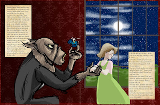
Some spreads from the pages - I handled most of the layout planning and painted the human character, whilst Joey dealt with the wolf and composing the image in photoshop.
They did not really like the below image for the catalogue... too busy a collage most probably - and yes I know there are some repeats from the folio, but I just wanted to show this off as it has some other fun little bits and bobs.
Please note the below editorial images are merely mock-ups of the website using my image - the images have never officially been used by either author or website.
Lastly, this is my image from the show guide. It uses a couple of poses from a character Joey (http://hajimesartblog.blogspot.com/) and myself used in our book 'The Problem', which sold pretty well at our degree show tyvm!
Some spreads from the pages - I handled most of the layout planning and painted the human character, whilst Joey dealt with the wolf and composing the image in photoshop.
They did not really like the below image for the catalogue... too busy a collage most probably - and yes I know there are some repeats from the folio, but I just wanted to show this off as it has some other fun little bits and bobs.
Thursday, 2 June 2011
Subscribe to:
Comments (Atom)


