Sunday, 31 October 2010

SLASH

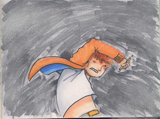
JOEY might hate me. ANYWAY. knocked up some stuff. I dont think these watercolour pencils worked as well as the watercolour before, but I dont have a great selection of either, so I think this looks a little better. With more time, I will def experiment with other mediums / mixing mediums...

 TBH the above needs to be... darker in spots. This is probbly something PS will become more and more useful with in this project. Edits after the fact ftw.

 Some stuff for Joey...


UPDATE: chucked on some basic textures... very. basic.


Friday, 29 October 2010

Improved layouts

The best results of yesterday. I think these might do the job actually....

8-9
 10-11
the BOOM could be 'CRACK' and then, on the subsequent page, there could be a 'BOOM' with the 'eruption'. Also, the left page feels a little bit clogged, but I think its ok.The flow is pretty good overall.
 12-13
the crack should probbly be more to the right, but you get the idea. The running might be better if he is just.. kinda.. standing there, waiting for it to come at him...
 14-15
needs to be more patchy in the background, to show that there is a gradual build up, and that the sky behind is still visible.
 no major changes here, but as I changed the arm which was raised in the previous image, thats pretty much all that changed here. Mirrored ftw.

Tuesday, 26 October 2010

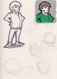
Some character designs

OK, so I have yet to properly sit down and research cool jumpers and jeans and other such stuff for the character, but here we have some facessss. Ta daaaahhh.


Thursday, 21 October 2010

Some stuff from today...

Sorry Joey, I had already done this by the time your email arrived.

All to do with page 8


some more updated layouts

Sup,

I did some drawings. Still improving layouts.

4-5
please ignoe the purple strip... Joey said he liked the way GREW was written so I thought, if he wanted to do some development on this page, he would have access to the scratchy scratchy wordy wordy.
 4-5
not as good as above...

###

8-9
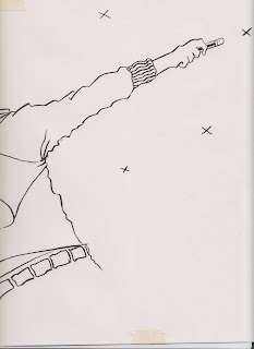
originally, the left page had the guy drawing the circle in the opposite direction, but I think this is better.. theres a line/curve which slides down from the palm/middle finger/arm which is quite nice. The pencil cuts straight across, but it serves to bring attention to the use of the pencil, so I think its obtrusiveness in the layout is acceptable. The right page will probbly need some tweaking, but the idea is solid enough....

 ###

10-11
hmm. not sure.
 10-11
My preferred design. I think the top of page 10 could be side on... or tilted. I dunno. Up to experimentation I supposeee. Bottom of page 10 would give the brief pause to show 'escape'... I like the right page, making use of the howl. This would lead in to page 12 being more dynamic with an impact like a previous iteration...
 10-11
way. too. basic.
 10-11
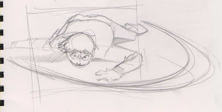
falls. lands. ouch. dusts self off. pause. HOOOOWWWWWLLLL

Monday, 18 October 2010

dont worry about this

receipt drop

Sigh

Spanner. Works. In.

2 - 3
Looks a bit smug : /

 4-5
Less smug. Allow it.

Whilst re-thinking some of the panelling, I slowed the pace down a little bit, thus stretching page count. In this context, it works. Will Joey be happy with this? I will discuss tomorrow.


ALT / NEW 1
 ALT / NEW 2-3
 ALT / NEW 4-5
HERE the page count gets pushed along... this would also have a knock on effect to the closing sequence (belowww)

 * * *

 ALT / NEW 25-26 (I think)

ALT / NEW 27-28 (thinks)
 ALT / NEW 29 (thinkah) with a touch of 4-5 re thinking.. which didnt work out great