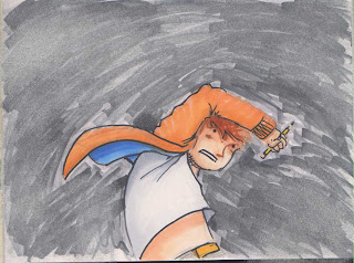
The best results of yesterday. I think these might do the job actually....
8-9
10-11
the BOOM could be 'CRACK' and then, on the subsequent page, there could be a 'BOOM' with the 'eruption'. Also, the left page feels a little bit clogged, but I think its ok.The flow is pretty good overall.
12-13
the crack should probbly be more to the right, but you get the idea. The running might be better if he is just.. kinda.. standing there, waiting for it to come at him...
14-15
needs to be more patchy in the background, to show that there is a gradual build up, and that the sky behind is still visible.
no major changes here, but as I changed the arm which was raised in the previous image, thats pretty much all that changed here. Mirrored ftw.


No comments:
Post a Comment