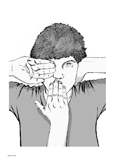
Hmm, this might be a hassle to print on a shirt. I think the fade would need to be done as a gradient if it were to ever be printable.Also still not too sure if the text is clear enough - I think on the thumbnail its obvious, but when the image is printed larger its a lot more difficult to tell. Also, the K in Block should be re-done.
Saturday, 15 October 2011
Friday, 14 October 2011
Friday, 7 October 2011
POST 201 less exciting
Sorry these arent as refined as the last two. Its getting a bit late, and I got really angry on the second page... I want him to appear menacing without literally grabbing the Father character and hoisting him up / pinning him down. it could just be that I need to flop it for the text to work, but that will be for a few days time, right now I need to leave these to twist around in my mind whilst I think about them.
POST 200!
This isn't what I was hoping to put up for post 200 - I wanted to make a funny picture, but I decided to show a couple of Beauty and the Beast compositions I am considering working up for my portfolio - I know the Waterstones competition didnt go my way, but I liked my character design, and I read the story with a mature edge anyway, so I thought a few more page layouts would go nicely in my portfolio.
Tuesday, 4 October 2011
Monday, 26 September 2011
Sunday, 25 September 2011
Axon
This little guy is a submission for a comic/book job. Im gonna make two more images using characters owned by the potential employer and see if they like me.
Friday, 23 September 2011
Portfolio
I thought it was time to refresh the portfolio, include a few bits I have done more recently.
Editorial
Graphic Design
Graphic Novel
Picture Book
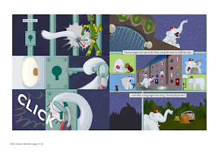
Below spread from a collaborative project with Joseph Fells
Storyboards
Saturday, 10 September 2011
Friday, 9 September 2011
TOP 5 for Uni Qlo tee competition
So these are my top 5 roughs, thinking I might put up a poll and see how it fares overnight to make a decision tomorrow on a final design...
Subscribe to:
Posts (Atom)


