Thursday 27 May 2010
New Starters
from Pokemon, fancied drawing them... Tsutaja is the grass, Pokabu the fire and Mijumaru the water. Sorry about the colour quality, I was missing an orange for Pokabu, used the wrong shade of green for Tsutaja's belly and the scanner didnt pick up most of the fine blue in the water spout...
What do you think
Of these? Which do people prefer? I know theres not a lot in it, the first has no shading, the second has shading, the third removes bingo wings, the fourth adds two letters and a punctuation mark.
Feed me feedback pls.
Thursday 20 May 2010
Olympic Mascot doodle
Olympic Mascot doodle, in no way, shape or form is this guy owned by me... was inspired because Mandeville (that is his name) just looks a little like metal sonic.
http://en.wikipedia.org/wiki/Wenlock_and_Mandeville for more
Saturday 15 May 2010
Some train drawings
Drawings. From the train journey home today. Central line was nice.
Put the more successful up top, less successful lower...
Put the more successful up top, less successful lower...
Friday 7 May 2010
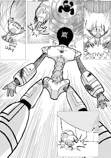
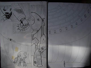
Last page...
Two Up
Ok, I only have two more pages to tone... and theyre both pretty intense. Will both take two hours each minimum. But I can smell the finish line, and it smells like whiskey and/or cider.
I am unsure about the black in the background... it feels necessary to show the depth of the space but it might just be my abuse of the gradient tool which is annoying me... I have a nagging feeling Im going to be let down by the scan quality when it all gets printed... Well, we shall see!
I am unsure about the black in the background... it feels necessary to show the depth of the space but it might just be my abuse of the gradient tool which is annoying me... I have a nagging feeling Im going to be let down by the scan quality when it all gets printed... Well, we shall see!
Next page!
Im sure Im pissing everyone off with individual page updates, but I like doing it and thats what counts. Anywho, I will aim to do two more before I update, maybe it wont clog up everyones stream too much...
I am not that happy with the splat, I didn't feel comfortable putting in liquidy highlights nor pushing the bloody goodness too far with lots of splattage... well. if I get a chance, I might try some splattage with ink on paper and scan that bad boy in, tweak my nipples etc
Thursday 6 May 2010
Last page of today
This tooka couple of hours... Bit longer than I hoped. Anyway, pretty happy with this page. I hope it isnt too confusing, whats going on in the bottom two panels...
Next Two
Self explanatory, the next two pages. I really like these two pages, uber dynamic...
I have also included a slightly amended first page, with murky red eyes for the crow. Mixed feelings towards this... It might be a bit TOO blunt for its own good. Opinions?
Once more, with feeling
Ok, page three, did this really quick. Not much tone to worry about though. Can you tell thats a sky through the window up top ??
FEEDBACK PLEASE part deux
SO I threw this together in two hours, less tone to worry about, I think it looks a better than the first one. Anyway, audience participation is a must here... Good? Bad?
Wednesday 5 May 2010
FEEDBACK PLEASE!?
OK, I want some feedback on how this has turned out. Do you like it? Dislike it? like the use of tone but is there too much of it? anything you dont like the look of? Hate it? Drop me whatever thoughts you have, I need to know if this works or not as I have two days to get this biznitch wrapped up and ready to print.
Tuesday 4 May 2010
Legs
Eleven. this one was quick, no major drama whilst inking. Slightly miffed at my use of hte french curve, but fuck it. hardly noticeable. I want to put more detail in the roof edging, but will probably leave that for photo shop fun times.
double digits
Im going to need more hands to count pages now :(
Very happy with this page, had a little mishap RIGHT at the end but I survived, came out stronger, am better for it (?)
I want to hit a dozen pages.. I know 14 was the target but I have time to consider. I also need to go to town today in order to reduce these images to A4 for photoshopping, which I can fiddle around with in the evening. phew
Monday 3 May 2010
Insightful
I have a few post-it notes dotted around my room, some are reminders, some are quotes.
Behind my chair is this constant reminder...
Behind my chair is this constant reminder...
Nein
The 9th page, easily my favourite one done so far. AND I didnt have to do too much cleaning up of hte image... managed to minimise the smudge of the ink as I was working. A few of hte FX lines are wrong here and there but fuck off, you do better.
side note - the 'jumping' silhouette in the robots eye will be c+p to the other eye in the final. just for clarity.
SUPRISE!?
Clem was surprised that I have two desks. One for my pc and games, the other for working on. I think I have a pretty cool set up...
I forget what page this is now
I lose count when I have to move on to my second hand. This was really quick, obviously, because there was nothing to draw. the next page is exciting, its prepped up on my lightbox, waiting for ink. also, the page below is the poor lit two page spread...
CHANGE OF PACE my workspace. This set up has changed a little to how I usually work... the board of reference drawings propped up against the wall are the new addition, and its actually really useful to have the reference right there in my facesticles. This table is actually a little bare as well... table is typically littered with paperwork and other art materials... I guess just inking makes hte tidy up easier.
note to self - need a daylight bulb
Seven
seventh inked. The page came together relatively quickly. I hit a couple of snags with the massive right panel, and the combat robot in the bottom of the page, but that will get photoshopped to perfetion I am sure.
PS the weather outside is weird. rain. wind. sun. clouds.
PS the weather outside is weird. rain. wind. sun. clouds.
combat robot
ok, so my comic has a fight scene which sprawls across about ten pages. The protagonist fights a combat robot in an arena, so this means I need to design an opponent! I initially pencilled something top heavy, with similar aesthetics as the main Pinnochio - torso atop a spine, bulky forearms on tube-like arms, similar detailing across the body.
So, I looked at the doodles I had and began development, the products of which you can see above. The middle page was where I began, the choice to develop being...
... this one here. He sports a similar look to Pin10, but is a lot chunkier... Wasnt sure about hte spine/pelvis, it looks like a piece of meat strung up... leading to...
This looks proportionally wrong for what I want, however the details are coming out, and the pelvis makes more sense to me now. I had Joey's voice in the back of my head telling me to do ball and sockets, but I don't want to show them on this character, as during the fight scene he does some stuff which requires a level of mystery in the detail... so I can get away with not showing it. CU's of the pelvis below
Finally, the hand. I wanted three fingers on a pronounced ball on the end of the chunky forearm. To escape any questions of HOW DOES THE JOINTS WORK well simple, the fingers and 'fist' are all magnetic, so they are all linked with nothing more than magnetism. That is the beauty of sci fi. It also means that the fingers could theoretically slide all over the 'fist; if needed, so whilst Im sure it would have its uses in certain situations, it is also likely a design flaw.
Thats kind of what Im aiming for with this design, to highlight that this giant chunky robot is just another step in the development. It's top heavy. It's overly chunky. Its nimble for its size, but is still a large target. I also hoped that the details which decorate its arms and legs give the impression its 'down', that its gravitating towards the floor TO LOSE brap.
I will do a 'final design' shortly, keep you posted internet
Sunday 2 May 2010
Sixth
OK, so this is the minimum for pages I should have completed for the hand in, however I have a pile of about 8 more pages which I would like to get at least inked in the next two or three days, leaving a couple of days for photoshopping. Please excuse the HORRIBLE crow middle right panel, the masking tape is where I had nothing better to hold it down. like glue. or KFC grease.
Pretty successful page overall. This page leads in to the... 4th page? I drew? I think it was 4th. With the Owl tumbling down the page. Once again, overall composition is so-so, but I think I pulled off some funky panel fun times.
Pretty successful page overall. This page leads in to the... 4th page? I drew? I think it was 4th. With the Owl tumbling down the page. Once again, overall composition is so-so, but I think I pulled off some funky panel fun times.
Pin10 rough design +update
So I was going through my doodles of Pinnochio and realised I still havent settled on one final image. So this is my attempt to summarise everythung. I know its not perfect, but with timeas it is I needed to get a design down. Any remarks would be lovely.
FYI the pink arent actual design.. colours.. I just wanted to seperate the possible line details from any sketchy lines I threw down...
Dave
FYI the pink arent actual design.. colours.. I just wanted to seperate the possible line details from any sketchy lines I threw down...
Dave
update- Joey suggested a visible ball and socket, instead of my ambiguous gap, so here is a quick sketch of the proposed ball and socket. Im gonna drop this in to PS on top of e original drawing shortly, will make a new post, see how it looks
filth
fifth. This one is probbly he most cluttered of compositions I have inked yet.... whilst Im not totally happy with the overall page composition, the individual panels all work well obn their own, and I actually think I did a few neat tricks here - see if you can spot what I mean.
GREAT SUCCESS (?)
GREAT SUCCESS (?)
Subscribe to:
Posts (Atom)


