Friday, 29 October 2010

Improved layouts

The best results of yesterday. I think these might do the job actually....

8-9
 10-11
the BOOM could be 'CRACK' and then, on the subsequent page, there could be a 'BOOM' with the 'eruption'. Also, the left page feels a little bit clogged, but I think its ok.The flow is pretty good overall.
 12-13
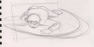
the crack should probbly be more to the right, but you get the idea. The running might be better if he is just.. kinda.. standing there, waiting for it to come at him...
 14-15
needs to be more patchy in the background, to show that there is a gradual build up, and that the sky behind is still visible.
 no major changes here, but as I changed the arm which was raised in the previous image, thats pretty much all that changed here. Mirrored ftw.

Tuesday, 26 October 2010

Some character designs

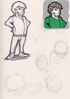
OK, so I have yet to properly sit down and research cool jumpers and jeans and other such stuff for the character, but here we have some facessss. Ta daaaahhh.


Thursday, 21 October 2010

Some stuff from today...

Sorry Joey, I had already done this by the time your email arrived.

All to do with page 8


some more updated layouts

Sup,

I did some drawings. Still improving layouts.

4-5
please ignoe the purple strip... Joey said he liked the way GREW was written so I thought, if he wanted to do some development on this page, he would have access to the scratchy scratchy wordy wordy.
 4-5
not as good as above...

###

8-9
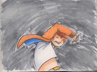
originally, the left page had the guy drawing the circle in the opposite direction, but I think this is better.. theres a line/curve which slides down from the palm/middle finger/arm which is quite nice. The pencil cuts straight across, but it serves to bring attention to the use of the pencil, so I think its obtrusiveness in the layout is acceptable. The right page will probbly need some tweaking, but the idea is solid enough....

 ###

10-11
hmm. not sure.
 10-11
My preferred design. I think the top of page 10 could be side on... or tilted. I dunno. Up to experimentation I supposeee. Bottom of page 10 would give the brief pause to show 'escape'... I like the right page, making use of the howl. This would lead in to page 12 being more dynamic with an impact like a previous iteration...
 10-11
way. too. basic.
 10-11
falls. lands. ouch. dusts self off. pause. HOOOOWWWWWLLLL

Monday, 18 October 2010

dont worry about this

receipt drop

Sigh

Spanner. Works. In.

2 - 3
Looks a bit smug : /

 4-5
Less smug. Allow it.

Whilst re-thinking some of the panelling, I slowed the pace down a little bit, thus stretching page count. In this context, it works. Will Joey be happy with this? I will discuss tomorrow.


ALT / NEW 1
 ALT / NEW 2-3
 ALT / NEW 4-5
HERE the page count gets pushed along... this would also have a knock on effect to the closing sequence (belowww)

 * * *

 ALT / NEW 25-26 (I think)

ALT / NEW 27-28 (thinks)
 ALT / NEW 29 (thinkah) with a touch of 4-5 re thinking.. which didnt work out great

Tuesday, 12 October 2010

Summer Project B - Extra Punctuation (The Escapist Magazine)

Both article A and B will feature the same intro, so if you read one, no need to go through the other...

For those of you who do not know, for the summer project I decided to do editorial illustrations, but with a TWIST. I wanted to create responses on subject matter close to my heart, so decided to do some internet scouting and picked two journo's who focus on video games - 1. Rob Fahey of GI.biz and 2. Ben 'Yahtzee' Croshaw with Extra Punctuation.

The reason I picked two, and these two specifically? They wite articles on both sides of the games industry coin: Fahey's articles lean towards the business matters, the who's who of the industry, but doesnt always stick to games-JUST-games. Yahtzee's editorials veer towards games as art, whether it be as light hearted as reminiscing about the quality of older games, or trolling the failings of modern companies.

So now, with 4 responses per person, I feel this is enough to finish up and concentrate wholly on the new project. Onward!

* * *
Project B focuses on the Extra Punctuation responses, I will link the original article as the title, give a short description of the article, and then two images - one of the response illustration, and the second a quick knock up in PhotoShop of how it would look.
Yahtzee discusses the concept of difficulty levels in games, and so I wade in to the discussion with a poignant little ditty about the music game genre - sure, they are great fun, hard as nails on the upper difficulties... but its still not a real guitar is it?


In response to the motion control tornado ripping through the industry, Yahtzee recognises they are a gimmick. I recognise they could lead to a WHOLE NEW REALM of possibilities... Apologies for my poor typography, I should have just stolen some Clip Art from Word.


Yahtzee defends Mario, stopping at this sequel... I create an image riffing off of the CoD Black Ops cover - a series perhaps past its time, at the very least being milked for all its worth.


A discussion about why this genre is so successful - that WE are the children wandering a dangerous land. In response, I did a fairly straightforward group shot of three of the protagonists mentioned in the article, on a very grey street. Could probably do with more people clustering around.
Whilst not the most inventive of the images shown, this image was one of the first times I used brush textures, so was a bit of a challenge in itself.


Summer Project A - GI.biz

Both article A and B will feature the same intro, so if you read one, no need to go through the other...

For those of you who do not know, for the summer project I decided to do editorial illustrations, but with a TWIST. I wanted to create responses on subject matter close to my heart, so decided to do some internet scouting and picked two journo's who focus on video games - 1. Rob Fahey of GI.biz and 2. Ben 'Yahtzee' Croshaw with Extra Punctuation.

The reason I picked two, and these two specifically? They wite articles on both sides of the games industry coin: Fahey's articles lean towards the business matters, the who's who of the industry, but doesnt always stick to games-JUST-games. Yahtzee's editorials veer towards games as art, whether it be as light hearted as reminiscing about the quality of older games, or trolling the failings of modern companies.

So now, with 4 responses per person, I feel this is enough to finish up and concentrate wholly on the new project. Onward!

* * *

Project A focuses on the GI.biz responses, I will link the original article as the title, give a short description of the article, and then two images - one of the response illustration, and the second a quick knock up in PhotoShop of how it would look.
P.S. to read the full articles, you need to sign up to the GI.biz website...

  
 An article concerning Google, and their possible expansion in to the games industry. The article mentions that Google has many assets it COULD use to expand in to other markets, so, a Tooled Up Android it is.


An article looking at Disney and their expansion in to the social gaming market - whilst RISK is not a part of their strategy, I felt that the board game RISK summed up their move quite aptly...


An article weighing up the choices of Microsoft in terms of their Kinect pricing strategy.


An article about Apple's realization that the games industry is profitable, and they are sitting on a potential goldmine of a user base. The Xbox logo sits off to the side, will they / won't they ever do a handheld? I decided to go with a Dad's Army feel, because thats what it is now - a handheld war. Not everyone will get the reference, but everyone should understand the visuals.